
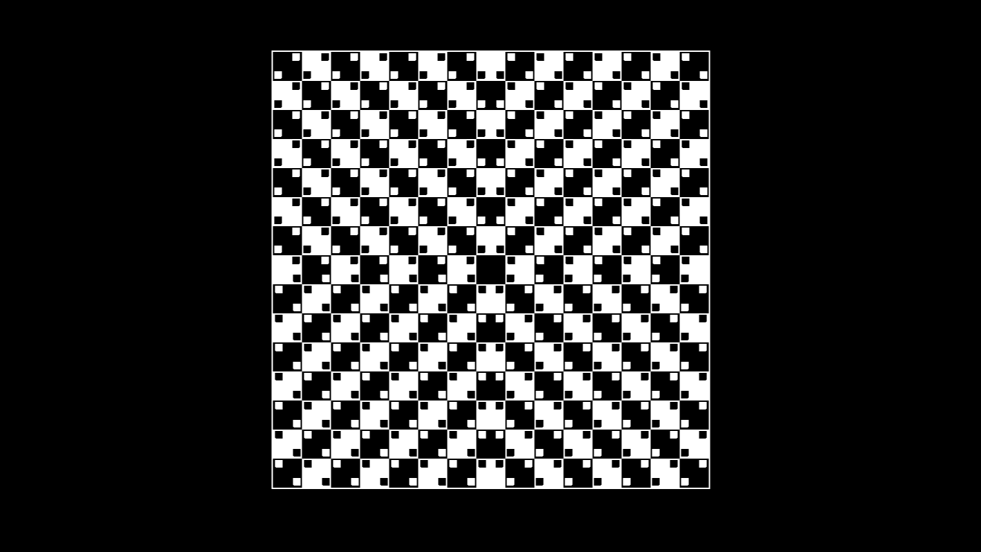
不到100行代码欺骗你的眼睛
2025-06-16
<!DOCTYPE html>
<html lang="en">
  <head>
    <meta charset="UTF-8" />
    <title>不到100行代码欺骗你的眼睛</title>
    <style>
      *,
      *::before,
      *::after {
        padding: 0;
        margin: 0 auto;
        box-sizing: border-box;
      }

      body {
        background-color: #000;
        color: #fff;
        min-height: 100vh;
        display: grid;
        place-items: center;
      }

      .illusion {
        --tileSize: 42px;

        -webkit-appearance: none;

        -moz-appearance: none;

        appearance: none;
        position: relative;
        font-size: 1vmin;
        width: calc(var(--tileSize) * 15);
        aspect-ratio: 1;
        outline: 2px solid #fff;
        background-image: repeating-conic-gradient(
          white 0 90deg,
          black 0 180deg
        );
        background-size: calc(var(--tileSize) * 2) calc(var(--tileSize) * 2);

        &::before,
        &::after {
          content: "";
          position: absolute;
          inset: 0;
          background-image: conic-gradient(
              at 25% 25%,
              transparent 270deg,
              white 0
            ),
            conic-gradient(at 25% 25%, transparent 270deg, white 0);
          background-size: 42px 42px;
          background-position: 2px 28px, 28px 2px;
          -webkit-clip-path: polygon(
            50% 0,
            50% 100%,
            100% 100%,
            100% 50%,
            0 50%,
            0 0
          );
          clip-path: polygon(50% 0, 50% 100%, 100% 100%, 100% 50%, 0 50%, 0 0);
          mix-blend-mode: difference;
          transition: background-position 0.6s ease-in-out;
        }

        &::after {
          rotate: 90deg;
        }

        &:checked {
          &::before {
            background-position: 28px 28px, 2px 2px;
          }
          &::after {
            background-position: 2px 2px, 28px 28px;
          }
        }
      }
    </style>
  </head>
  <body>
    <input type="checkbox" class="illusion" />
  </body>
</html>