
动态渐变文字
2025-06-17
<!DOCTYPE html>
<html lang="en">
<head>
<meta charset="UTF-8" />
<title>动态渐变文字</title>
<meta name="viewport" content="width=device-width, initial-scale=1" />
<style>
/*
these type the CSS variable as color
unlocking the ability for the browser
to animate just that portion
*/
@property --@color-1 {
syntax: "<color>";
inherits: false;
initial-value: hsl(98 100% 62%);
}
@property --@color-2 {
syntax: "<color>";
inherits: false;
initial-value: hsl(204 100% 59%);
}
/* keyframes that change the color variable */
@-webkit-keyframes gradient-change {
to {
--@color-1: hsl(210 100% 59%);
--@color-2: hsl(310 100% 59%);
}
}
@keyframes gradient-change {
to {
--@color-1: hsl(210 100% 59%);
--@color-2: hsl(310 100% 59%);
}
}
article {
/* apply variable changes over time */
-webkit-animation: gradient-change 2s linear infinite alternate;
animation: gradient-change 2s linear infinite alternate;
background: linear-gradient(
/*
in oklch produces more vibrant gradient results
learn more https://developer.chrome.com/docs/css-ui/access-colors-spaces#color_interpolation
*/
to right in oklch,
/* use the variables in a gradient (or wherever!) */ var(--@color-1),
var(--@color-2)
);
/* old browser support */
-webkit-background-clip: text;
-webkit-text-fill-color: transparent;
/* modern browser version */
background-clip: text;
color: transparent;
}
@layer demo.support {
h1 {
font-size: 10vmin;
line-height: 1.1;
}
body {
background: hsl(204 100% 5%);
min-block-size: 100%;
box-sizing: border-box;
display: grid;
place-content: center;
font-family: system-ui, sans-serif;
font-size: min(200%, 4vmin);
padding: 5vmin;
}
h1,
p,
body {
margin: 0;
text-wrap: balance;
}
h1 {
line-height: 1.25cap;
}
p {
font-family: "Dank Mono", ui-monospace, monospace;
}
html {
block-size: 100%;
}
article {
display: grid;
gap: 1lh;
text-align: center;
}
}
</style>
</head>
<body>
<article>
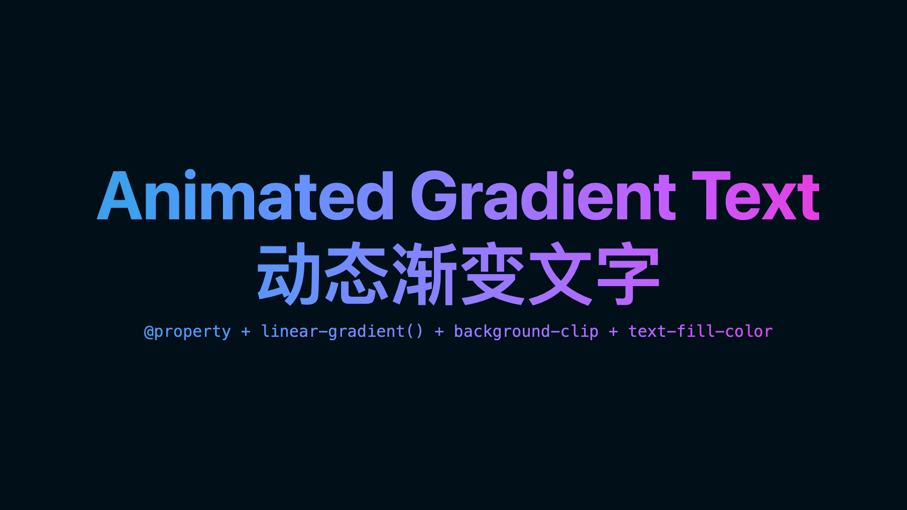
<h1>Animated Gradient Text</h1>
<h1>动态渐变文字</h1>
<p>@property + linear-gradient() + background-clip + text-fill-color</p>
</article>
</body>
</html>