
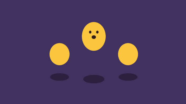
3D 效果的加载动画
2025-07-28
<!DOCTYPE html>
<html lang="zh">
  <head>
    <meta charset="UTF-8" />
    <title>3D 效果的加载动画</title>
    <style>
      :root {
        --animation-time: 1s;
        --animation-time-double: 2s;
      }

      *,
      *::before,
      *::after {
        box-sizing: border-box;
        padding: 0;
        margin: 0;
      }

      html {
        font-size: 62.5%;
      }

      body {
        min-height: 100vh;
        display: grid;
        grid-template-columns: 12rem 12rem 12rem;
        column-gap: 1rem;
        place-items: center;
        justify-content: center;
        background-color: #41315e;
      }

      .loader {
        font-size: 1rem;
      }

      .loader--1,
      .loader--3 {
        transform: scale(0.8);
      }

      .loader--2 * {
        animation-delay: 0.2s;
      }

      .dot {
        position: relative;
        background-color: rgb(255, 197, 62);
        width: 10em;
        height: 10em;
        z-index: 5;
        border-radius: 50%;
        overflow: hidden;
        transform-origin: bottom;
        animation-duration: var(--animation-time);
        animation-iteration-count: infinite;
        animation-name: bounce;
        animation-timing-function: ease;
      }

      .loader--2 .face {
        animation-duration: var(--animation-time-double);
        animation-iteration-count: infinite;
        animation-name: face;
        animation-timing-function: ease;
      }

      .eyes {
        position: absolute;
        top: 3em;
        left: 3em;
        background-color: rgb(42, 25, 15);
        height: 1em;
        width: 1em;
        border-radius: 50%;
        box-shadow: 3em 0 0 rgb(42, 25, 15);
      }
      .mouth {
        position: absolute;
        background-color: rgb(42, 25, 15);
        height: 0.5em;
        width: 2em;
        left: 4em;
        top: 5em;
        animation-duration: var(--animation-time-double);
        animation-iteration-count: infinite;
        animation-name: mouth;
        animation-timing-function: ease;
      }

      .shadow {
        width: 10em;
        height: 4em;
        border-radius: 50%;
        background-color: rgba(0, 0, 0, 0.322);
        margin-top: -2em;
        animation-duration: var(--animation-time);
        animation-iteration-count: infinite;
        animation-name: shadow;
        animation-timing-function: ease;
      }

      @keyframes bounce {
        0% {
          transform: scale(1, 1) translateY(0);
        }
        10% {
          transform: scale(1.1, 0.9) translateY(0);
        }
        50% {
          transform: scale(0.9, 1.1) translateY(-10em);
        }
        100% {
          transform: scale(1, 1) translateY(0);
        }
      }

      @keyframes shadow {
        0% {
          transform: scale(1, 1);
        }
        10% {
          transform: scale(1.1);
        }
        50% {
          transform: scale(0.8);
        }
        100% {
          transform: scale(1, 1);
        }
      }

      @keyframes mouth {
        0% {
          border-radius: 0%;
          transform: scale(1, 1);
        }
        50% {
          border-radius: 0%;
          transform: scale(1, 1);
        }
        75% {
          border-radius: 50%;
          transform: scale(0.9, 2.5);
        }
        100% {
          border-radius: 0%;
          transform: scale(1, 1);
        }
      }

      @keyframes face {
        0% {
          transform: scaleY(1) translateY(0);
          opacity: 1;
        }
        5% {
          transform: scaleY(1) translateY(0);
          opacity: 1;
        }
        15% {
          transform: scaleY(0.8) translateY(-10em);
          opacity: 1;
        }
        17% {
          transform: scaleY(0.8) translateY(-10em);
          opacity: 0;
        }
        22% {
          transform: scaleY(0.8) translateY(10em);
          opacity: 0;
        }
        25% {
          transform: scaleY(0.8) translateY(10em);
          opacity: 1;
        }
        50% {
          transform: scaleY(1) translateY(0);
          opacity: 1;
        }
        100% {
          transform: scaleY(1) translateY(0);
          opacity: 1;
        }
      }
    </style>
  </head>
  <body>
    <div class="loader loader--1">
      <div class="dot"></div>
      <div class="shadow"></div>
    </div>
    <div class="loader loader--2">
      <div class="dot">
        <div class="face">
          <div class="eyes"></div>
          <div class="mouth"></div>
        </div>
      </div>
      <div class="shadow"></div>
    </div>
    <div class="loader loader--3">
      <div class="dot"></div>
      <div class="shadow"></div>
    </div>
  </body>
</html>